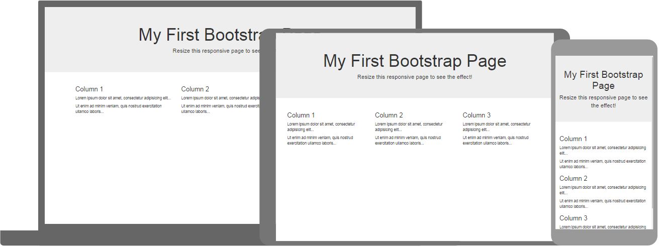
What is Bootstrap?
Bootstrap is the most popular CSS Framework for developing responsive and mobile-first websites.
Bootstrap 4 is the newest version of Bootstrap
Bootstrap Quickstart

Example
<div class="jumbotron text-center">
<h1>My First Bootstrap
Page</h1>
<p>Resize this page to see the responsive
effect!</p>
</div>
<div class="container-fluid">
<div class="row">
<div class="col-sm-4">
<h2>London</h2>
<p>London is the capital city of England.</p>
<p>It is the most populous city in the United Kingdom,
with a
metropolitan area of over 13 million inhabitants.</p>
</div>
<div class="col-sm-4">
<h2>Paris</h2>
<p>Paris is
the capital of France.</p>
<p>The Paris area is one of the largest
population centers in Europe,
with more than 12 million
inhabitants.</p>
</div>
<div
class="col-sm-4">
<h2>Tokyo</h2>
<p>Tokyo is the capital of Japan.</p>
<p>It
is the center of the Greater Tokyo Area,
and the most populous
metropolitan area in the world.</p>
</div>
</div>
</div>
Try it Yourself »Click on the "Try it Yourself" button to see how it works.
Browser Support
Bootstrap 4 is the newest version of Bootstrap.
Bootstrap 4 supports all major browsers except Internet Explorer 9.
If you require support for IE9 or IE8, you must use Bootstrap 3.
Bootstrap Containers
The container class is one of the most important Bootstrap classes.
It provides margins, padding, alignments, and more, to HTML elements.
Example
<div class="container">
<h1>This is a paragraph</h1>
<p>This is a paragraph</p>
<p>This is a paragraph</p>
<p>This is a paragraph</p>
<p>This is a paragraph</p>
</div>
Try it Yourself »
Bootstrap Colors
London is the most populous city in the United Kingdom, with a metropolitan area of over 9 million inhabitants.
London is the most populous city in the United Kingdom, with a metropolitan area of over 9 million inhabitants.
London is the most populous city in the United Kingdom, with a metropolitan area of over 9 million inhabitants.
London is the most populous city in the United Kingdom, with a metropolitan area of over 9 million inhabitants.
London is the most populous city in the United Kingdom, with a metropolitan area of over 9 million inhabitants.
London is the most populous city in the United Kingdom, with a metropolitan area of over 9 million inhabitants.
London is the most populous city in the United Kingdom, with a metropolitan area of over 9 million inhabitants.
Example
<div class="container bg-primary text-white py-4">
<p>London is the
most populous city in the United Kingdom, with a metropolitan area of over 9
million inhabitants.</p>
</div>
<div class="container bg-success
text-white py-4">
<p>London is the most populous city in the United
Kingdom, with a metropolitan area of over 9 million inhabitants.</p>
</div>
Try it Yourself »
Bootstrap Text Colors
This text is muted.
This text is important.
This text indicates success.
This text represents some information.
This text represents a warning.
This text represents danger.
Example
<div class="container">
<p class="text-muted">This text is
muted.</p>
<p class="text-primary">This text is important.</p>
<p
class="text-success">This text indicates success.</p>
<p
class="text-info">This text represents some information.</p>
<p
class="text-warning">This text represents a warning.</p>
<p
class="text-danger">This text represents danger.</p>
</div>
Try it Yourself »
Bootstrap Columns
Three equal-width columns, on all devices and screen widths:
Example
<div class="row">
<div class="col">.col</div>
<div class="col">.col</div>
<div class="col">.col</div>
</div>
Try it Yourself »
Responsive Columns
Three equal-width columns scaling to stack on top of each other on small screens:
Example
<div class="row">
<div class="col-sm-4">.col-sm-4</div>
<div class="col-sm-4">.col-sm-4</div>
<div class="col-sm-4">.col-sm-4</div>
</div>
Try it Yourself »
Bootstrap Tables
A boredered zebra-striped table:
| Firstname | Lastname | |
|---|---|---|
| John | Doe | john@example.com |
| Mary | Moe | mary@example.com |
| July | Dooley | july@example.com |
Example
<table class="table table-striped table-bordered">
<thead>
<tr>
<th>Firstname</th>
<th>Lastname</th>
<th>Email</th>
</tr>
</thead>
<tbody>
<tr>
<td>John</td>
<td>Doe</td>
<td>john@example.com</td>
</tr>
<tr>
<td>Mary</td>
<td>Moe</td>
<td>mary@example.com</td>
</tr>
<tr>
<td>July</td>
<td>Dooley</td>
<td>july@example.com</td>
</tr>
</tbody>
</table>
Try it Yourself »
Bootstrap Alerts
Bootstrap provides an easy way to create predefined alert messages:
Example
<div class="alert alert-success">
<strong>Success!</strong> Indicates a successful or positive action.
</div>
Try it Yourself »
Bootstrap Buttons
Bootstrap provides different styles of buttons:
Example
<button type="button" class="btn">Basic</button>
<button type="button" class="btn btn-primary">Primary</button>
<button type="button" class="btn btn-secondary">Secondary</button>
<button type="button" class="btn btn-success">Success</button>
<button type="button" class="btn btn-info">Info</button>
<button type="button" class="btn btn-warning">Warning</button>
<button type="button" class="btn btn-danger">Danger</button>
<button type="button" class="btn btn-dark">Dark</button>
Try it Yourself »
Boodstrap Cards
Example
<div class="card" style="width:400px">
<img src="img_avatar1.png"
alt="Card image">
<div class="card-body">
<h4
class="card-title">John Doe</h4>
<p
class="card-text">Some example text.</p>
<a href="#"
class="btn btn-primary">See Profile</a>
</div>
</div>
Try it Yourself »
Full Bootstrap Tutorial
This has been a short description of Bootstrap.
For a full Bootstrap tutorial go to W3Schools Bootstrap Tutorial.
For a full Bootstrap reference go to W3Schools Bootstrap Reference.


