SVG Drop Shadows
<defs> and <filter>
All SVG filters are defined within a <defs> element. The <defs> element is short for definitions and contains definition of special elements (such as filters).
The <filter> element is used to define an SVG filter. The <filter> element has a required id attribute which identifies the filter. The graphic then points to the filter to use.
SVG <feOffset>
Example 1
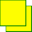
The <feOffset> element is used to create drop shadow effects. The idea is to take an SVG graphic (image or element) and move it a little bit in the xy plane.
The first example offsets a rectangle (with <feOffset>), then blend the original on top of the offset image (with <feBlend>):

Here is the SVG code:
Example
<svg height="120" width="120">
<defs>
<filter id="f1" x="0" y="0" width="200%" height="200%">
<feOffset result="offOut" in="SourceGraphic" dx="20"
dy="20" />
<feBlend in="SourceGraphic" in2="offOut"
mode="normal" />
</filter>
</defs>
<rect width="90" height="90" stroke="green" stroke-width="3"
fill="yellow" filter="url(#f1)" />
</svg>
Try it Yourself »
Code explanation:
- The id attribute of the <filter> element defines a unique name for the filter
- The filter attribute of the <rect> element links the element to the "f1" filter
Example 2
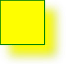
Now, the offset image can be blurred (with <feGaussianBlur>):

Here is the SVG code:
Example
<svg height="140" width="140">
<defs>
<filter id="f2" x="0" y="0" width="200%" height="200%">
<feOffset result="offOut" in="SourceGraphic" dx="20"
dy="20" />
<feGaussianBlur result="blurOut" in="offOut"
stdDeviation="10" />
<feBlend in="SourceGraphic" in2="blurOut"
mode="normal" />
</filter>
</defs>
<rect width="90" height="90" stroke="green" stroke-width="3"
fill="yellow" filter="url(#f2)" />
</svg>
Try it Yourself »
Code explanation:
- The stdDeviation attribute of the <feGaussianBlur> element defines the amount of the blur
Example 3
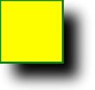
Now, make the shadow black:

Here is the SVG code:
Example
<svg height="140" width="140">
<defs>
<filter id="f3" x="0" y="0" width="200%" height="200%">
<feOffset result="offOut" in="SourceAlpha" dx="20"
dy="20" />
<feGaussianBlur result="blurOut" in="offOut"
stdDeviation="10" />
<feBlend in="SourceGraphic" in2="blurOut"
mode="normal" />
</filter>
</defs>
<rect width="90" height="90" stroke="green" stroke-width="3"
fill="yellow" filter="url(#f3)" />
</svg>
Try it Yourself »
Code explanation:
- The in attribute of the <feOffset> element is changed to "SourceAlpha" which uses the Alpha channel for the blur instead of the entire RGBA pixel
Example 4
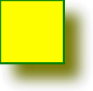
Now, treat the shadow as a color:

Here is the SVG code:
Example
<svg height="140" width="140">
<defs>
<filter id="f4" x="0" y="0" width="200%" height="200%">
<feOffset result="offOut" in="SourceGraphic" dx="20"
dy="20" />
<feColorMatrix result="matrixOut" in="offOut"
type="matrix"
values="0.2 0 0 0 0 0 0.2 0 0 0 0 0 0.2 0 0 0 0 0
1 0" />
<feGaussianBlur result="blurOut" in="matrixOut"
stdDeviation="10" />
<feBlend in="SourceGraphic" in2="blurOut"
mode="normal" />
</filter>
</defs>
<rect width="90" height="90" stroke="green" stroke-width="3"
fill="yellow" filter="url(#f4)" />
</svg>
Try it Yourself »
Code explanation:
- The <feColorMatrix> filter is used to transform the colors in the offset image closer to black. The three values of '0.2' in the matrix all get multiplied by the red, green and blue channels. Reducing their values brings the colors closer to black (black is 0)

