CSS Fonts
The CSS font properties define the font family, boldness, size, and the style of a text.
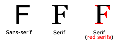
Difference Between Serif and Sans-serif Fonts

CSS Font Families
In CSS, there are two types of font family names:
- generic family - a group of font families with a similar look (like "Serif" or "Monospace")
- font family - a specific font family (like "Times New Roman" or "Arial")
| Generic family | Font family | Description |
|---|---|---|
| Serif | Times New Roman Georgia |
Serif fonts have small lines at the ends on some characters |
| Sans-serif | Arial Verdana |
"Sans" means without - these fonts do not have the lines at the ends of characters |
| Monospace | Courier New Lucida Console |
All monospace characters have the same width |
Note: On computer screens, sans-serif fonts are considered easier to read than serif fonts.
Font Family
The font family of a text is set with the font-family property.
The font-family property should hold several font names as a "fallback" system.
If the browser does not support the first font, it tries the next font, and so
on.
Start with the font you want, and end with a generic family, to let the browser pick a similar font in the generic family, if no other fonts are available.
Note: If the name of a font family is more than one word, it must be in quotation marks, like: "Times New Roman".
More than one font family is specified in a comma-separated list:
For commonly used font combinations, look at our Web Safe Font Combinations.
Font Style
The font-style property is mostly used to specify italic text.
This property has three values:
- normal - The text is shown normally
- italic - The text is shown in italics
- oblique - The text is "leaning" (oblique is very similar to italic, but less supported)
Example
p.normal {
font-style: normal;
}
p.italic {
font-style: italic;
}
p.oblique {
font-style: oblique;
}
Try it Yourself »
Font Size
The font-size property sets the size of the text.
Being able to manage the text size is important in web design. However, you should not use font size adjustments to make paragraphs look like headings, or headings look like paragraphs.
Always use the proper HTML tags, like <h1> - <h6> for headings and <p> for paragraphs.
The font-size value can be an absolute, or relative size.
Absolute size:
- Sets the text to a specified size
- Does not allow a user to change the text size in all browsers (bad for accessibility reasons)
- Absolute size is useful when the physical size of the output is known
Relative size:
- Sets the size relative to surrounding elements
- Allows a user to change the text size in browsers
Note: If you do not specify a font size, the default size for normal text, like paragraphs, is 16px (16px=1em).
Set Font Size With Pixels
Setting the text size with pixels gives you full control over the text size:
Tip: If you use pixels, you can still use the zoom tool to resize the entire page.
Set Font Size With Em
To allow users to resize the text (in the browser menu), many developers use em instead of pixels.
The em size unit is recommended by the W3C.
1em is equal to the current font size. The default text size in browsers is 16px. So, the default size of 1em is 16px.
The size can be calculated from pixels to em using this formula: pixels/16=em
Example
h1 {
font-size: 2.5em; /* 40px/16=2.5em */
}
h2 {
font-size: 1.875em; /* 30px/16=1.875em */
}
p {
font-size: 0.875em; /* 14px/16=0.875em */
}
Try it Yourself »
In the example above, the text size in em is the same as the previous example in pixels. However, with the em size, it is possible to adjust the text size in all browsers.
Unfortunately, there is still a problem with older versions of IE. The text becomes larger than it should when made larger, and smaller than it should when made smaller.
Use a Combination of Percent and Em
The solution that works in all browsers, is to set a default font-size in percent for the <body> element:
Example
body {
font-size: 100%;
}
h1 {
font-size: 2.5em;
}
h2 {
font-size: 1.875em;
}
p {
font-size: 0.875em;
}
Try it Yourself »
Our code now works great! It shows the same text size in all browsers, and allows all browsers to zoom or resize the text!
Font Weight
The font-weight property specifies the weight of a font:
Responsive Font Size
The text size can be set with a vw unit, which means the "viewport width".
That way the text size will follow the size of the browser window:
Hello World
Resize the browser window to see how the font size scales.
Viewport is the browser window size. 1vw = 1% of viewport width. If the viewport is 50cm wide, 1vw is 0.5cm.
Font Variant
The font-variant property specifies whether or not a text should
be displayed in a small-caps font.
In a small-caps font, all lowercase letters are converted to uppercase letters. However, the converted uppercase letters appears in a smaller font size than the original uppercase letters in the text.
More Examples
All the font properties in one
declaration
This example demonstrates how to use the shorthand property for setting all of
the font properties in one declaration.
Test Yourself with Exercises!
All CSS Font Properties
| Property | Description |
|---|---|
| font | Sets all the font properties in one declaration |
| font-family | Specifies the font family for text |
| font-size | Specifies the font size of text |
| font-style | Specifies the font style for text |
| font-variant | Specifies whether or not a text should be displayed in a small-caps font |
| font-weight | Specifies the weight of a font |

