Balance
All works of art possess some form of visual balance – a sense of weighted clarity created in a composition. The artist arranges balance to set the dynamics of a composition. A really good example is in the work of Piet Mondrian , whose revolutionary paintings of the early 20th century used non-objective balance instead of realistic subject matter to generate the visual power in his work. In the examples below you can see that where the white rectangle is placed makes a big difference in how the entire picture plane is activated.
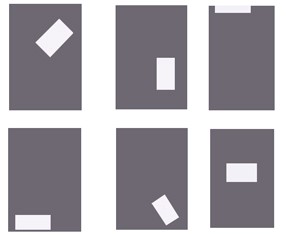
Chris Gildow, 'Balance'
The example on the top left is weighted towards the top and the diagonal orientation of the white shape makes the whole area a sense of movement. The top middle example is weighted more towards the bottom, but still maintains a sense that the white shape is floating. On the top right, the white shape is nearly off the picture plane altogether, leaving most of the remaining area visually empty. This arrangement works if you want to have a feeling of loftiness or simply to direct the viewer’s eyes to the top of the composition. The lower left example is perhaps the least dynamic, the white shape resting at the bottom, mimicking the horizontal bottom edge of the ground. The overall sense here is restful, heavy and without any dynamic character. The bottom middle composition is weighted decidedly towards the bottom right corner, but again, the diagonal orientation of the white shape leaves some sense of movement. Lastly, the lower right example places the white shape directly in the middle on a horizontal axis. This is visually the most stable, but lacks any sense of movement. Refer to these six diagrams when you are determining the visual weight of specific artworks.
There are three basic forms of visual balance:
- Symmetrical
- Asymmetrical
- Radial

Chris Gildow, 'Examples of Visual Balance'
Left: Symmetrical. Middle: Asymmetrical. Right: Radial.
Symmetrical Balance
Symmetrical balance is the most visually stable, and characterized by an exact – or nearly exact - compositional design on either (or both) sides of the horizontal or vertical axis of the picture plane. Symmetrical compositions are usually dominated by a central anchoring element. There are many examples of symmetry in the natural world that reflect an aesthetic dimension. 'Moon Jellyfish' fits this description; ghostly lit against a black background, but absolute symmetry in its design.

Luc Viator, 'Moon Jellyfish', digital image
But symmetry’s inherent stability can sometimes preclude a static quality. View the Tibetan scroll painting to see the implied movement of the central figure Vajrakilaya. The visual busyness of the shapes and patterns surrounding the figure are balanced by their compositional symmetry, and the wall of flame behind Vajrakilaya tilts to the right as the figure itself tilts to the left. Tibetan scroll paintings use the symmetry of the figure to symbolize their power and spiritual presence.
Spiritual paintings from other cultures employ this same balance for similar reasons. Sano di Pietro’s ‘Madonna of Humility’, painted around 1440, is centrally positioned, holding the Christ child and forming a triangular design, her head the apex and her flowing gown making a broad base at the bottom of the picture. Their halos are visually reinforced with the heads of the angels and the arc of the frame.

Sano di Peitro, 'Madonna of Humility', c.1440, tempera and tooled gold and silver on panel. Brooklyn Museum , New York
The use of symmetry is evident in three-dimensional art too. A famous example is the Gateway Arch in St. Louis, Missouri. Commemorating the westward expansion of the United States, its stainless steel frame rises over 600 feet into the air before gently curving back to the ground. Another example is Richard Serra’s 'Tilted Spheres'. The four massive slabs of steel show a concentric symmetry and take on an organic dimension as they curve around each other, appearing to almost hover above the ground.

Eero Saarinen, 'Gateway Arch', 1963-65, stainless steel, 630’ high. St. Louis, Missouri.

Richard Serra, 'Tilted Spheres', 2002 – 04, Cor-ten steel, 14’ x 39’ x 22’. Pearson International Airport, Toronto, Canada
Asymmetry
Asymmetry uses compositional elements that are offset from each other, creating a visually unstable balance. Asymmetrical visual balance is the most dynamic because it creates a more complex design construction. A graphic poster from the 1930’s shows how offset positioning and strong contrasts can increase the visual effect of the entire composition.

Poster from the Library of Congress Archives
Claude Monet’s ‘Still Life with Apples and Grapes’ from 1880 uses asymmetry in its design to enliven an otherwise mundane arrangement. First, he sets the whole composition on the diagonal, cutting off the lower left corner with a dark triangle. The arrangement of fruit appears haphazard, but Monet purposely sets most of it on the top half of the canvas to achieve a lighter visual weight. He balances the darker basket of fruit with the white of the tablecloth, even placing a few smaller apples at the lower right to complete the composition.
Monet and other Impressionist painters were influenced by Japanese woodcut prints, whose flat spatial areas and graphic color appealed to the artist’s sense of design.
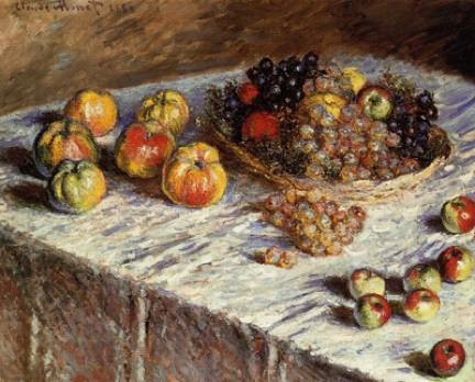
Claude Monet, 'Still Life with Apples and Grapes', 1880, oil on canvas. The Art Institute of Chicago.
One of the best-known Japanese print artists is Ando Hiroshige . You can see the design strength of asymmetry in his woodcut ‘Shinagawa on the Tokaido’, one of a series of works that explores the landscape around the Takaido road. You can view many of his works through the hyperlink above.
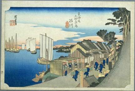
Hiroshige, 'Shinagawa on the Tokaido', ukiyo-e print, after 1832
In Henry Moore’s ‘Reclining Figure’ the organic form of the abstracted figure, strong lighting and precarious balance obtained through asymmetry make the sculpture a powerful example in three-dimensions.
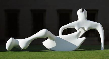
Andrew Dunn, 'Reclining Figure', Henry Moore, 1951, painted bronze. Fitzwilliam Museum, Cambridge
Radial Balance
Radial balance suggests movement from the center of a composition towards the outer edge - or vise versa. Many times radial balance is another form of symmetry, offering stability and a point of focus at the center of the composition.
Buddhist mandala paintings offer this kind of balance almost exclusively. Similar to the scroll painting we viewed previously, the image radiates outward from a central spirit figure. In the example below there are six of these figures forming a star shape in the middle. Here we have absolute symmetry in the composition, yet still generating a feeling of movement by virtue of the concentric circles within a rectangular format.
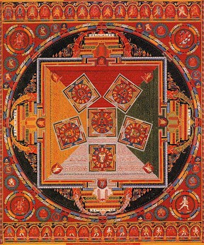
Tibetan Mandala of the Six Chakravartins, c. 1429-46. Central Tibet (Ngor Monestary).