Excel 2000
Editing Charts
Introduction
By the end of this lesson, you should be able to:
- Make changes to the data presented in a chart.
-
Format the following parts of a chart:
- Title
- Legend
- Category axis and value axis
- Data series color
Changing the data in a chart
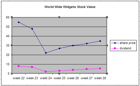
When you add a chart to your worksheet, Excel creates a link between the chart and your source data. This way, any changes you make to the original source data are instantly reflected in your chart.
You can also add rows or columns of data to an existing chart by selecting Add Data on the Chart menu.
To add data to an existing chart:
- Select the chart you want to edit.
-
Choose
Chart
 Add Data
.
Add Data
.
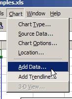
- Enter the range you want to add in the Add Data dialog box, or select the range of cells you want to add to your chart.
-
Click
OK
.
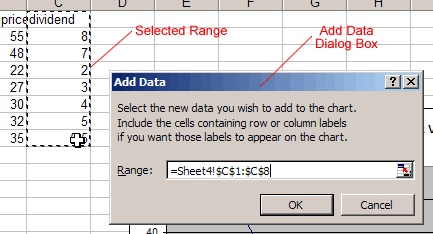
Your chart should update to display the new data.
Editing the chart title
Be sure to select a meaningful title for your chart.
To change the title of a chart:
- Click the chart title.
-
Use the cursor to select text.
- Make any changes you want to the text.
- Click anywhere outside of the title to apply your changes.
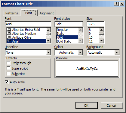
Formatting the chart title
In addition to selecting the right title for your chart, you can use the Format Chart Title dialog box to apply several types of formatting, including:
- Title color and pattern
- Font, size and style
- Title alignment
To format the chart title:
- Select the chart title .
-
Click the
format button
 on the
Chart toolbar
, or double-click the chart title.
on the
Chart toolbar
, or double-click the chart title.
- Use the different tabs of the Format Chart Title dialog box to apply formatting to your title.
-
Click
OK
.
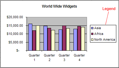
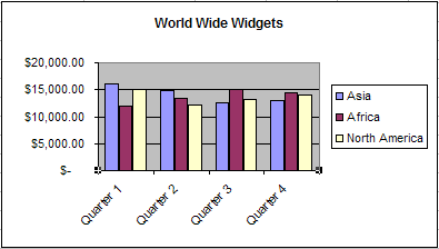
Formatting the chart legend
The chart legend displays useful information. Be sure to format the legend so it is as clear as possible.
To format the chart legend:
-
If the legend is not showing, press the show/hide legend button
 on the
Chart toolbar
.
on the
Chart toolbar
.
- Click the chart legend .
-
Click the
format button
 on the
Chart toolbar
, or double-click the chart legend.
on the
Chart toolbar
, or double-click the chart legend.
- Use the different tabs of the Format Chart Legend dialog box to apply formatting to the legend.
-
Click
OK
.
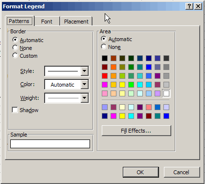
![]() The only way to change the actual text of the legend is to make changes to the source data.
The only way to change the actual text of the legend is to make changes to the source data.
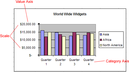
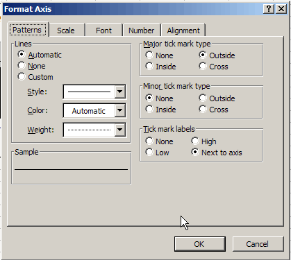
Formatting the value and category axes
You have several options when formatting the value and category axes of your chart. In addition to changing font, color, and style, you can adjust the numbers on the scale of the chart.
To format a chart axis:
- Select the axis you want to edit.
-
Click the
format button
 on the
Chart toolbar
, or double-click the chart axis.
on the
Chart toolbar
, or double-click the chart axis.
- Use the different tabs of the Format Axis dialog box to apply formatting.
-
Click
OK
.
![]() You can also use the
angle axis
buttons
You can also use the
angle axis
buttons
 on the Chart toolbar to change the angle of the value and category axes.
Changing the color of a data series
You can apply formatting to each data series of a chart. Although you can change different aspects of each data series, you will probably find that you change the color of bars, columns, pie slices, and areas most often.
To change the color of a data series:
-
Select the data series you want to edit.
-
Click the
format button
 on the
Chart toolbar
, or double-click the data series.
on the
Chart toolbar
, or double-click the data series.
-
Use the
Format Data Series
dialog box to pick a new color.
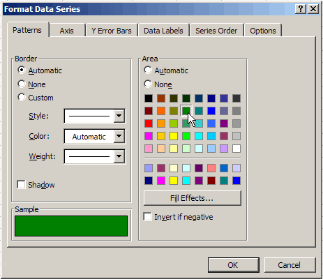
- Click OK .
Your chart should display the new colors.
Challenge!
- Practice formatting the different parts of a chart.
-
Try the following formatting changes on a chart:
- Change the font and size of the title.
- Angle the category axis labels.
- Change the scale of the value axis.
- Use new colors for each data series in your chart.