Excel Tips
Using the Quick Analysis Tool

Using the Quick Analysis tool
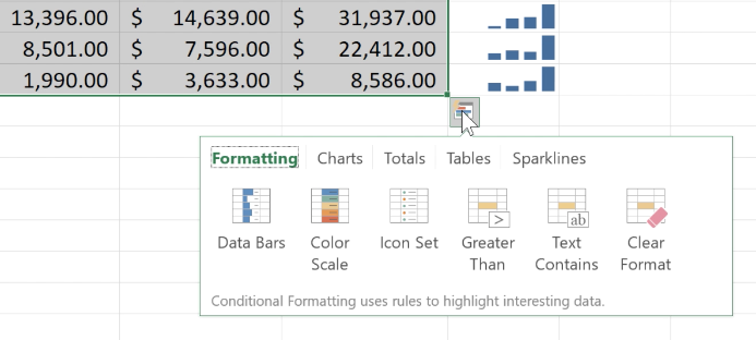
There are a lot of ways to visualize data in Excel, but sometimes it's hard to know where to start. Luckily, the Quick Analysis tool lets you browse through many different options even if you don't know exactly what you want.
Whenever you select a cell range, the Quick Analysis button will appear in the lower-right corner of the selection. When you click it, you'll be able to choose from a variety of charts, sparklines, conditional formatting options, and more. Best of all, the options will be tailored to your specific data, helping you find relevant visualizations quickly.

Watch the video below to learn how to use the Quick Analysis tool.