Business Communication
How to Format a Business Document

How to format a business document

Formatting a business document can seem daunting, but we’re here to help boost your confidence. With a little practice, you can get your document looking organized and professional.
Watch the video below to learn some tips for formatting business documents.
Your company may use its own style to format its documents, such as using a particular font or color scheme. If so, your company's style should always take priority over the tips in this lesson.
Keep it simple
When handling important business topics, it may be tempting to format your document in a decorative and intricate fashion. However, the key to effective formatting is to keep it simple , even if your document's subject matter is humongous and complex.
Simple formatting allows the content itself to be the focal point while making your document easy to read and navigate. After all, if the formatting is taking focus away from the content, it's not doing its job.
Formatting basics
Simple and effective formatting begins with a few key tips that can be applied to virtually any business document:
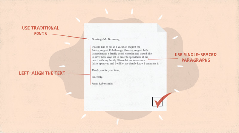
- Use traditional fonts, such as Times New Roman or Arial.
- Left-align the text.
- Use single-spaced paragraphs .
To learn more about text formatting, review our lesson on
Choosing Fonts for Business Documents
, or refer to our
Word 2016
tutorial.
As you use these tips, remember to be consistent throughout your document. To see how inconsistency can hurt you, look at the business letter example below. The font changes four times, the text shifts from single double spacing, and the alignment changes twice. It doesn't look professional, does it?

Different types of documents
With several types of business documents out there, remember that each one may have unique formatting needs. For instance, business reports may require page numbers or a cover page, while a memo may require your company’s letterhead. Always keep the needs of your document type in mind as you format, and you will better serve your audience.
To learn more about various document types, review our lessons on business emails , memos , reports , and letters .
Using graphics
If you use graphics like images and charts in your document, make sure they’re clear and legible. While you should use as many graphics as necessary, don’t add them solely for decoration. Otherwise, the extra visuals can take over the document and bury your message.
In the following example, the only graphic is a chart that's easy to read and doesn't dominate the page.

Properly formatting a business document can make a big difference in the quality of your work. Take time to format and organize your message, and it will be professional, clear, and effective.