Beginning Graphic Design
Images

The power of images
Images can be a powerful force in design. No matter what the subject, we're naturally drawn to them. From beautiful, high-definition photos to carefully crafted graphics , they're usually the first thing we see.
However, images aren't just for decoration. In design, they're the hook that draws the viewer in . Compelling visuals can help you connect with the audience—and make a strong impression—before they've even read a single word.
Watch the video to learn more about images.
Finding images
You don't have to be an artist to use images in your work. All it takes is a little creativity and a willingness to think outside the box. With the right resources, you can learn to set your designs apart. First: finding high-quality images for almost any type of project.

Using stock
Maybe you're handy with a camera or have some graphic design experience—that's great! If not, don't panic. There are countless online sources that offer images for exactly this purpose.

The truth is, most people (including professionals) rely on free or low-cost images called stock . Stock is perfect when you need something specific —for example, a photo of a tiny dog in a teacup—and you don't have the time or resources to create it yourself.

Choosing effective stock
Most stock image sites let you browse or search their offerings. Look for results that are relevant to your project, but also unique in some way.

In this example, we've searched for the word travel . The image below would be a fine choice because it subtly illustrates the concept but has a personal feel.

As viewers, we're are naturally drawn to images that feel authentic , like distinct but believable photos and graphics that tell a story. The best images are somewhat open ended . T hey set the tone for your project but leave room for interpretation.
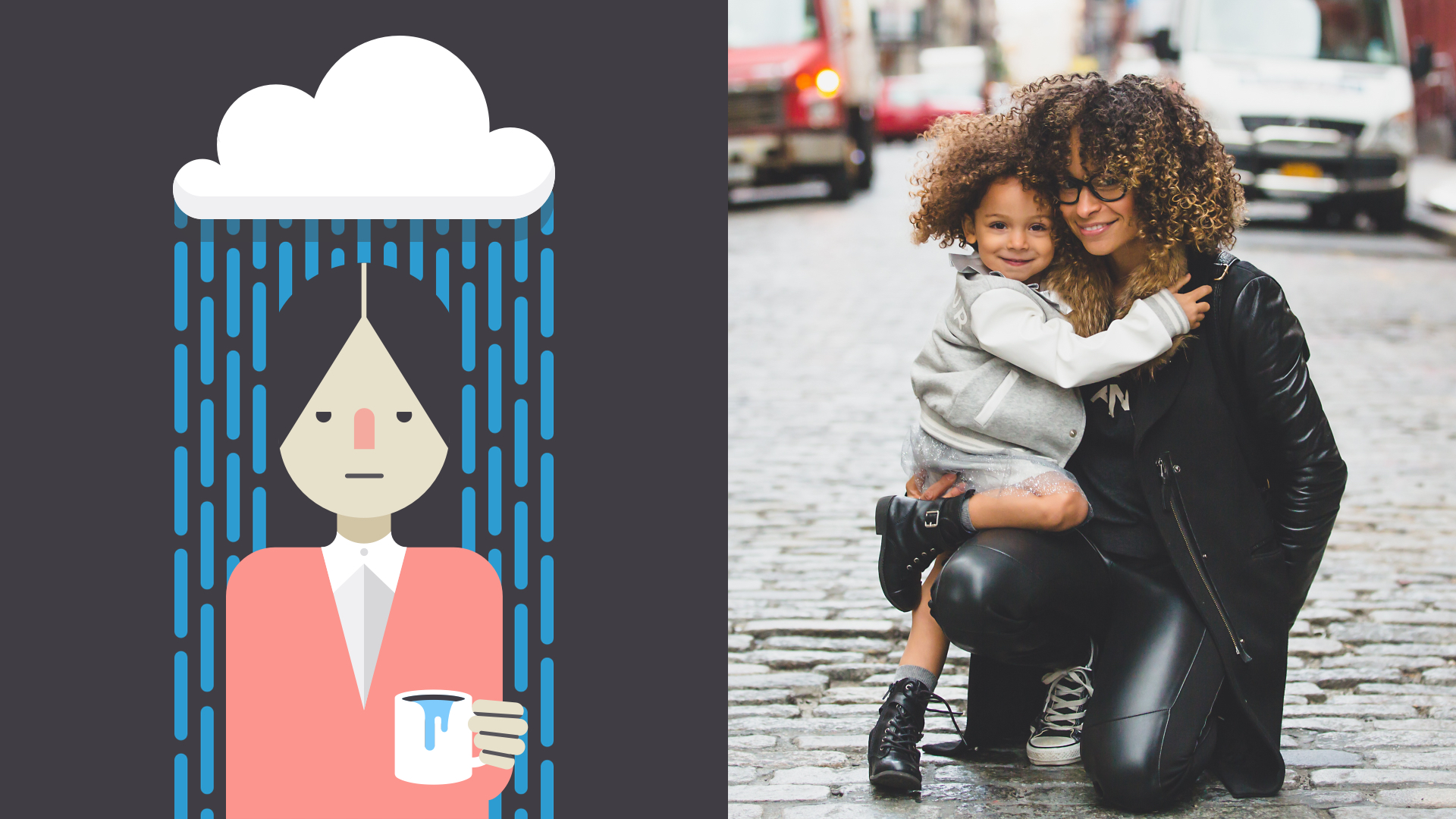
Some stock images are just too generic to be effective. For instance, how many times have you seen a business presentation with something like the graphic below?

For a more modern, professional design, avoid images that lack context or are too literal in meaning. Instead, look for imagery that's connected to your work, but in a more subtle , relatable way.

Image usage rights
Almost every stock image has a license that states how it can be used. Some are very generous and ask for little or nothing in return. Others are more restrictive and can have serious legal ramifications if disobeyed.
Before you use a stock image, make sure you understand the license associated with it (you might need to do some research if it isn't clearly explained). If the license isn't listed alongside the image, double check the stock provider's policies or FAQ s .
To learn more about usage rights in general, review our
Copyright and Fair Use
lesson. For specific information on images, visit
StockPhotoRights.com
.
The importance of quality
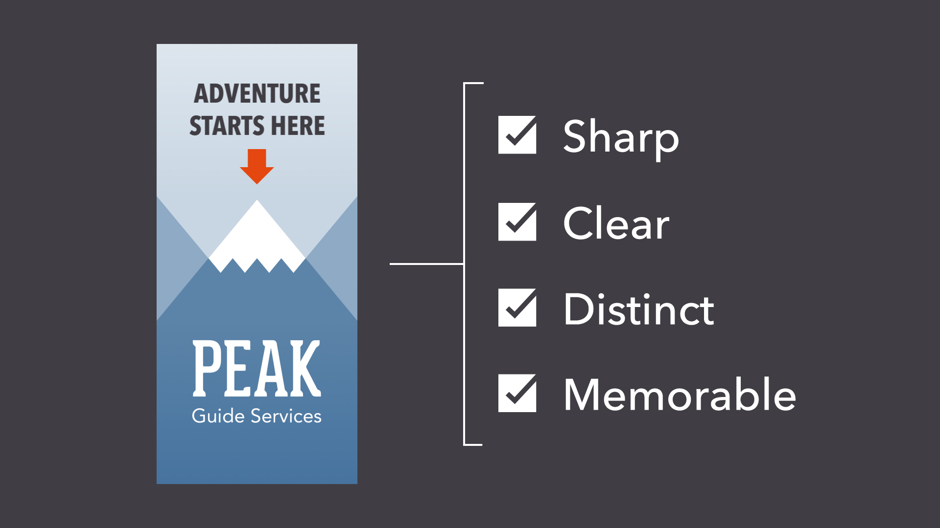
Of course, it's not just about content. There's also a technical side to images, which can have a big impact on your design. It doesn't matter if the photo you've chosen is absolutely perfect in every other way. If it's blurry or pixelated, it could give the wrong impression .
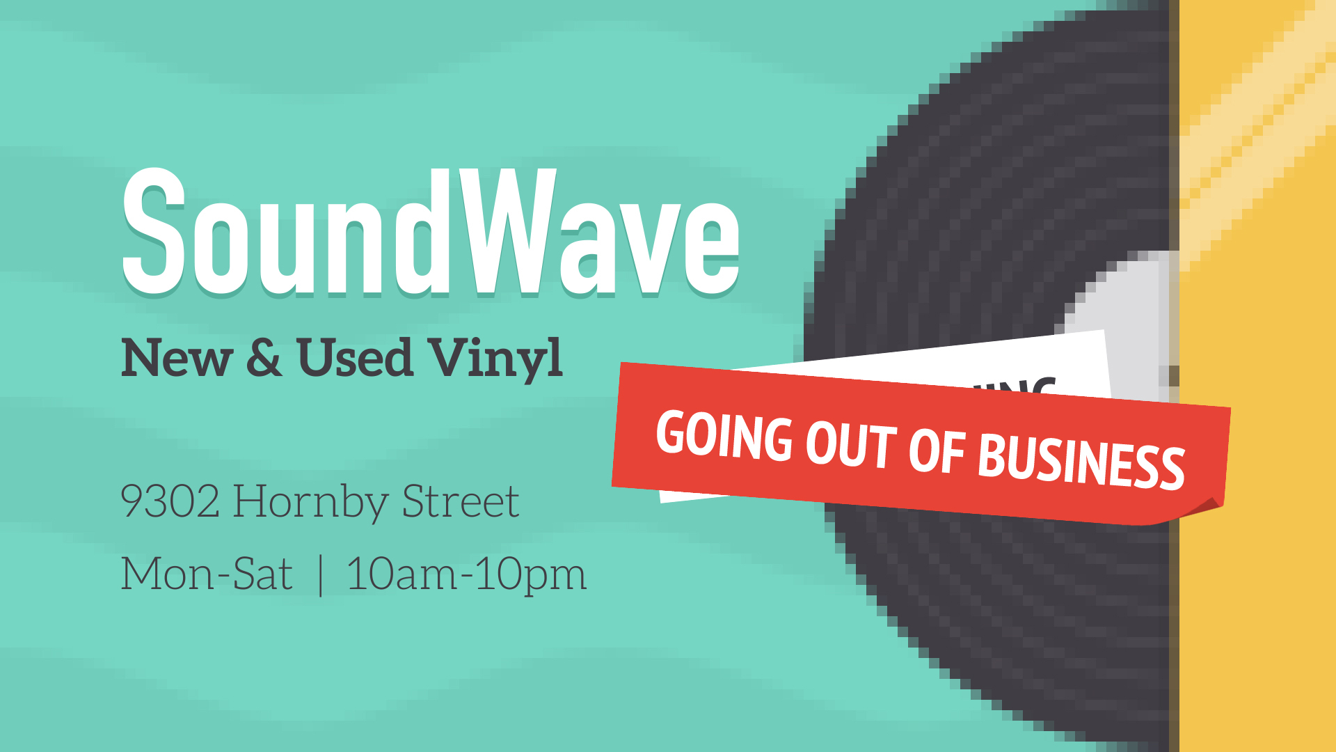
Look for high-quality images that are sharp, clear, and free of distortion. In general, bigger is better , because it gives you more to work with. A large, high-resolution image can always be cropped or sized down , depending on the needs of the project.

Unfortunately, it doesn't work the other way around. If you enlarge a small image—in other words, make it bigger than its original size —there will be a noticeable loss in quality. The image will become blurry and/or distorted, as in the example below.

Raster vs. vector
There's a reason small images lose quality when you enlarge them. It's because they're made up of thousands—sometimes even millions—of tiny little pixels . The word for this type of image is raster .

When you view a raster image at its original size or smaller , the pixels are invisible—they're just too small to see. They only become apparent when you zoom in or make the image larger.

Vector graphics are quite different from raster. You can make them any size , big or small, without losing quality. In the example below, the image has been enlarged, but there's no pixelation—not even a little bit.
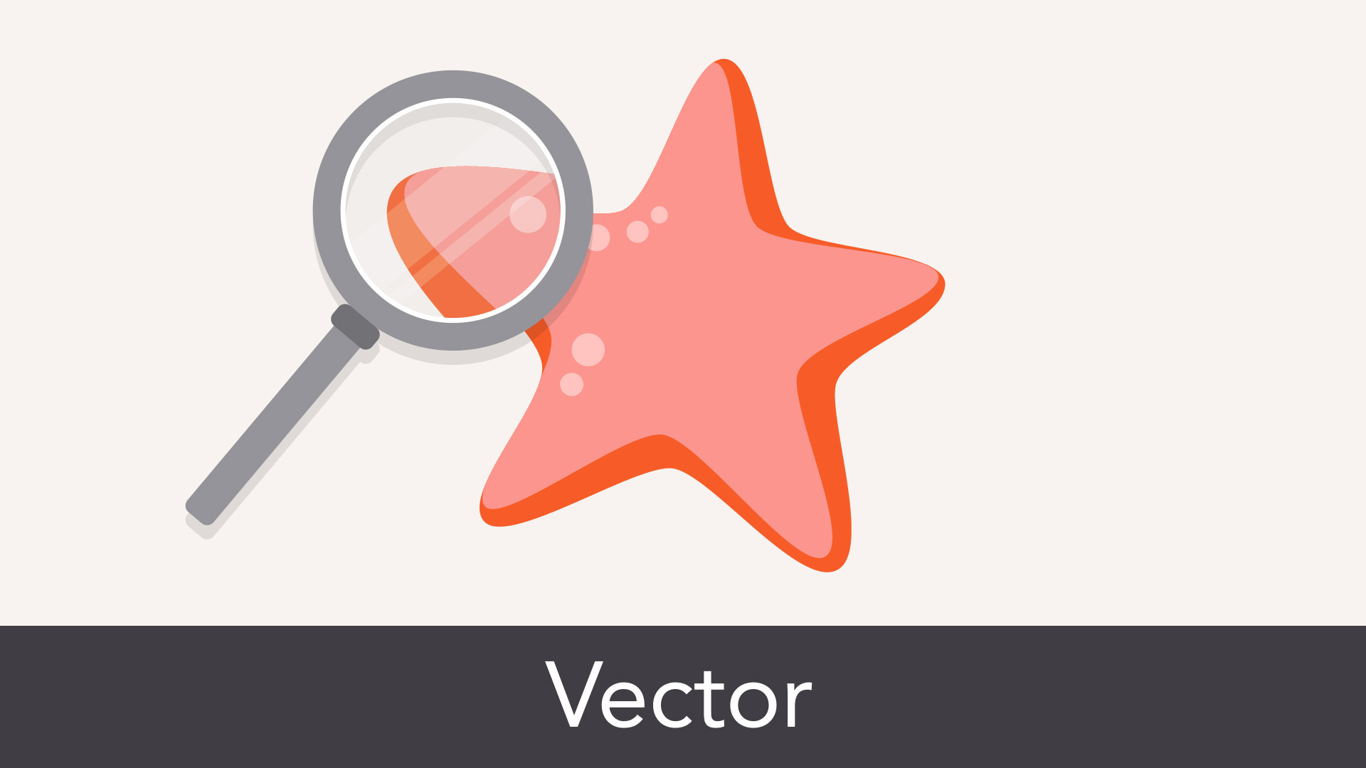
That's because vectors are made of something more complex than pixels. They're rendered using a special form of geometry . You're not likely to find vector graphics outside of professional design settings, but it's good to know what they are.
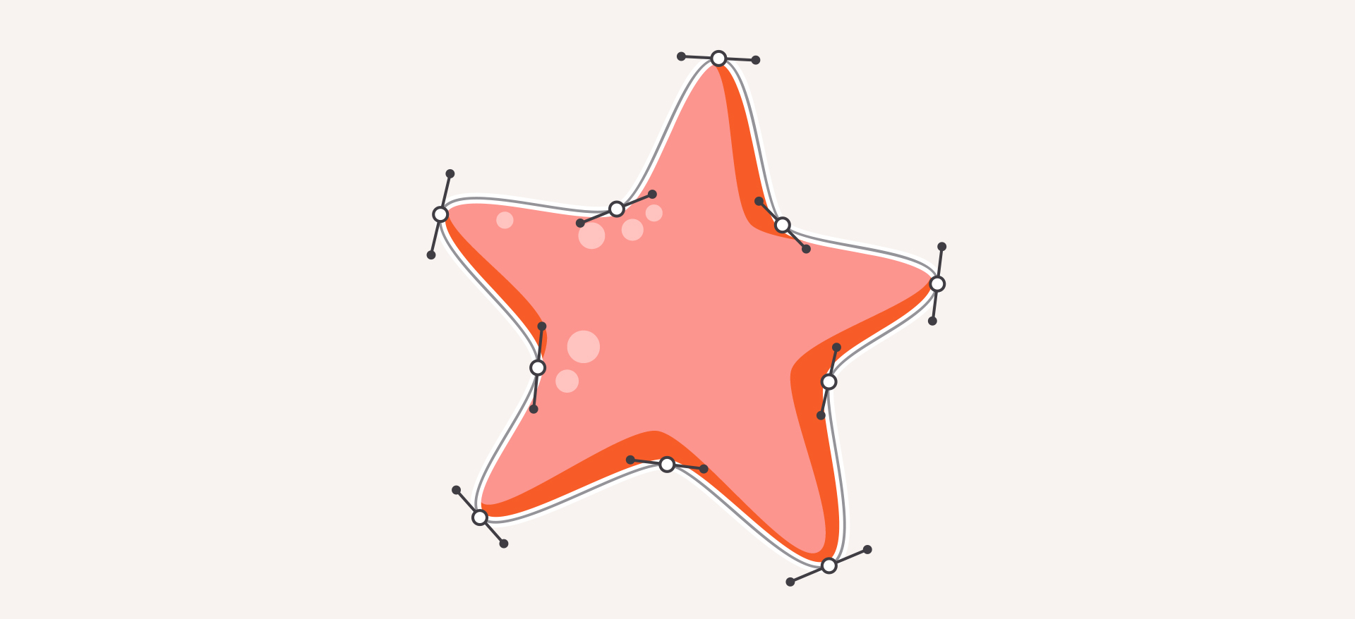
Editing images
Few stock images are perfect as is, even if they're technically high-quality ones. Maybe the image is the wrong size or the colors could use some work. Fortunately, even basic programs let you make simple adjustments . Look for these options the next time you need to fix or enhance an image.

For a closer look at image editing, read our Image Editing 101 tutorial.
Cropping
Cropping can be used to change the size, shape, or focus of an image, making it useful in many different situations.

Try this feature if your graphic is the wrong dimensions, or if it includes something you'd rather cut out.

Resizing
Resizing an image will ensure it's the perfect fit for your project. Just remember that you can't make an image bigger than its original size without affecting its quality.
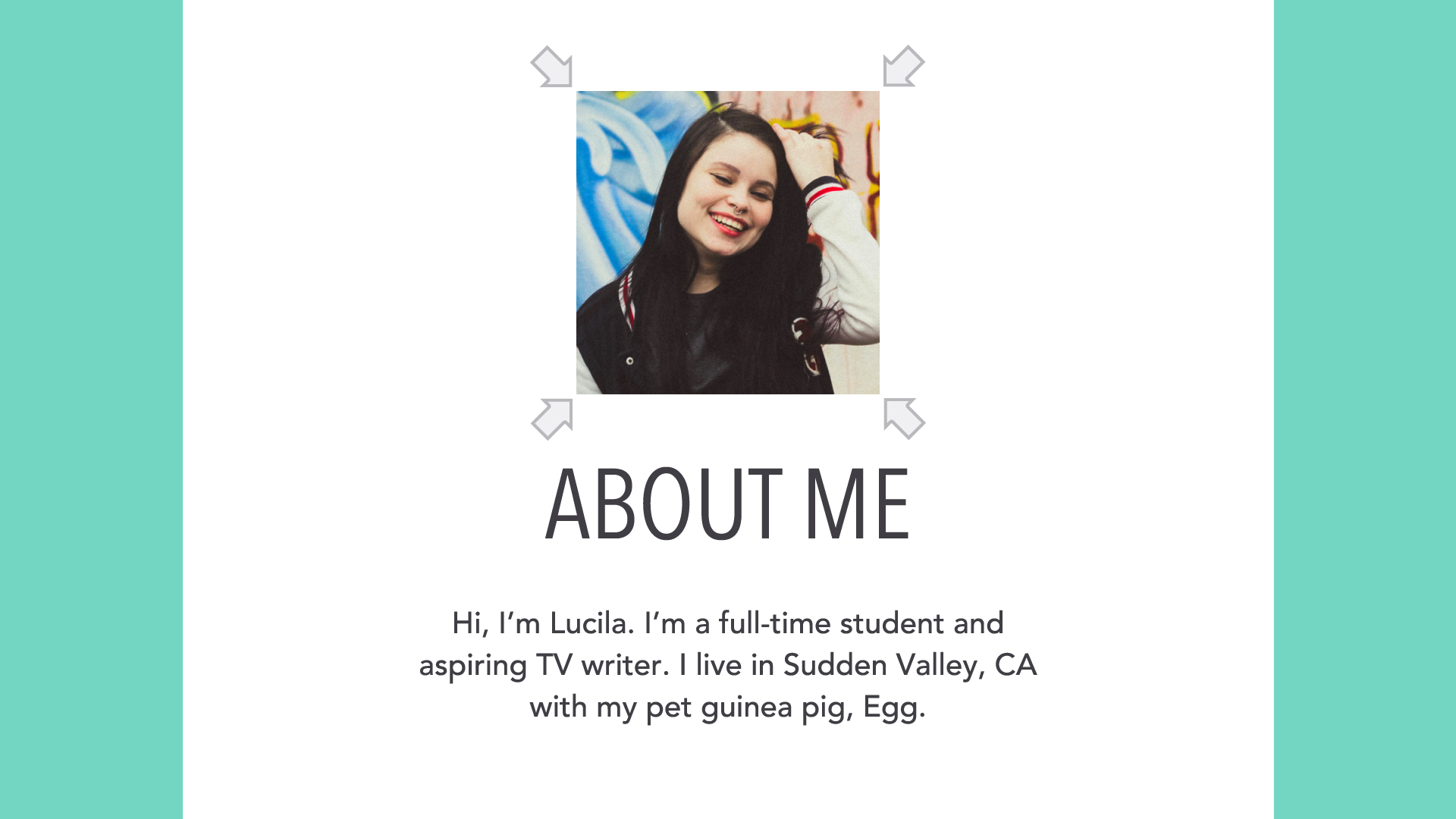
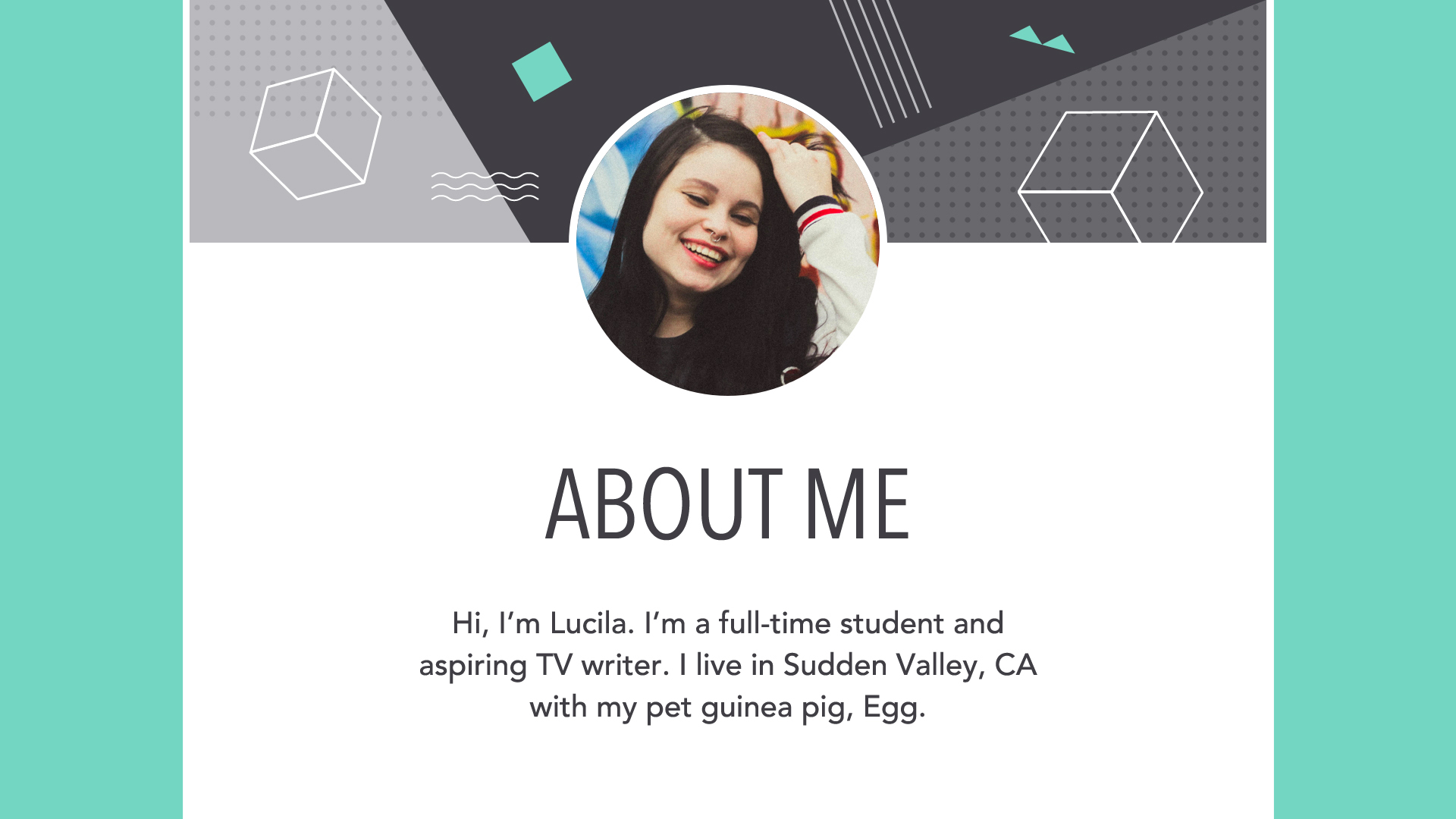
If the image you're working with simply isn't big enough, it's best to choose something else. You can also find a creative way to work with the image size you have. In the example below, we've added a background image instead of enlarging the portrait.
Other adjustments
Cosmetic adjustments let you enhance certain image qualities, including brightness, contrast, saturation, and color.
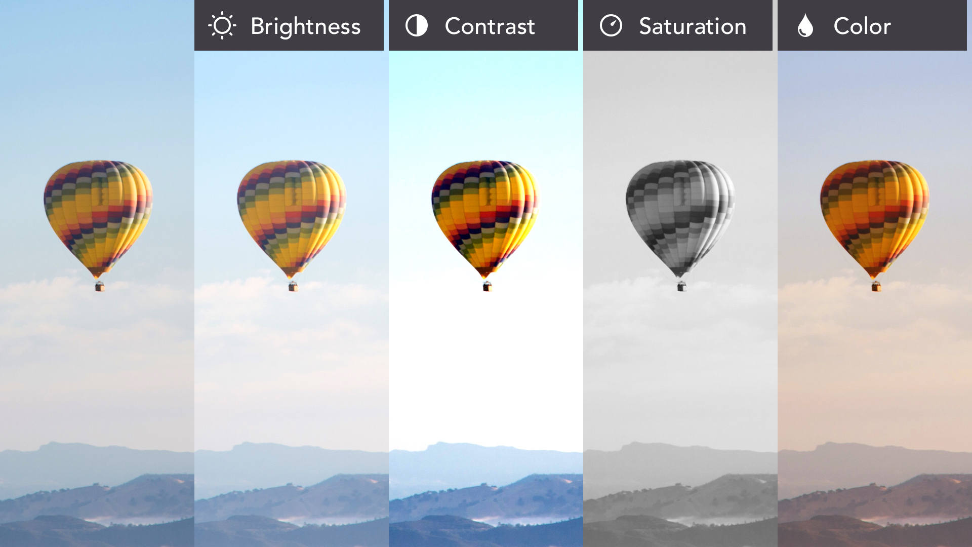
If your favorite program offers filters or presets , you can change your image dramatically with very little time and effort.

Putting it all together
Adding photos , graphics , and other visuals to your work is a great way to make it more engaging. Even a simple background image can transform your design into something special.

Just remember what you've learned about image quality —both technical and conceptual—and your work is sure to stand out for the right reasons.
We hope you enjoyed learning the basics of images!
Be sure to check out the rest of our graphic design topics, including: